React and SPFx Interview Questions with Scenarios and Code Examples
Introduction
React and SharePoint Framework (SPFx) are popular technologies used in modern web development, especially for building user interfaces and custom web parts in SharePoint. Preparing for interviews involving these technologies requires a solid understanding of core concepts, practical scenarios, and coding proficiency. In this blog, we’ll cover essential interview questions, different scenarios, and code examples to help you ace your React and SPFx interviews.
Section 1: React Interview Questions
1. What is the Virtual DOM, and how does it improve performance in React?
Scenario: Imagine you’re building a dashboard with multiple widgets that update frequently. How would React's Virtual DOM help optimize performance in this case?
Explanation: React uses a Virtual DOM, an in-memory representation of the real DOM. When the state of an element changes, React updates the Virtual DOM first. It then calculates the difference (diffing) between the previous and current states of the Virtual DOM. Finally, it updates only the necessary parts of the real DOM. This minimizes the number of direct manipulations of the actual DOM, leading to better performance.
Code Example:
function DashboardWidget() {
  const [count, setCount] = React.useState(0);

  return (
    <div>
      <p>Widget count: {count}</p>
      <button onClick={() => setCount(count + 1)}>Increment</button>
    </div>
  );
}
In the example above, only the text inside the <p> tag will be updated in the real DOM when the count changes, thanks to the Virtual DOM.
2. What are React Hooks, and why are they useful?
Scenario: You need to manage state in a functional component and run some side effects when the component mounts or updates. How would you do this using React Hooks?
Explanation:
React Hooks allow functional components to manage state and side effects, previously only possible in class components. Key hooks include useState for state management and useEffect for handling side effects like data fetching or DOM manipulation.
Code Example:
jsx
import React, { useState, useEffect } from 'react';

function UserProfile({ userId }) {
  const [user, setUser] = useState(null);

  useEffect(() => {
    // Simulate data fetching
    fetchUser(userId).then(data => setUser(data));
  }, [userId]);

  return (
    <div>
      {user ? <h1>{user.name}</h1> : <p>Loading...</p>}
    </div>
  );
}
In this example, useState manages the user data state, and useEffect fetches the data when the component mounts or when the userId prop changes.
3. How would you optimize a large list rendering in React?
Scenario: You’re developing a React component that displays a list of thousands of items. Rendering them all at once would cause performance issues. How would you optimize this?
Explanation:
To optimize rendering large lists, you can use techniques like virtualization, where only a small subset of the list is rendered at any given time. Libraries like react-window or react-virtualized help achieve this.
Code Example:
import { FixedSizeList as List } from 'react-window';

const items = Array.from({ length: 10000 }, (_, index) => `Item ${index + 1}`);

function LargeList() {
  return (
    <List
      height={500}
      itemCount={items.length}
      itemSize={35}
      width={300}
    >
      {({ index, style }) => (
        <div style={style}>{items[index]}</div>
      )}
    </List>
  );
}
Here, react-window helps render only the visible items in the list, significantly improving performance.
Section 2: SPFx Interview Questions
1. What is the SharePoint Framework (SPFx), and why is it used?
Scenario: You’ve been asked to build a custom web part for a SharePoint Online site. Why would you choose SPFx over other methods?
Explanation: SPFx is a model for building customizations on SharePoint that work in both modern and classic experiences. It supports client-side development, integration with the SharePoint data, and uses open-source tooling. SPFx provides full support for modern JavaScript frameworks like React, allowing developers to build responsive and mobile-friendly web parts.
2. How do you create a simple SPFx web part using React?
Scenario: You need to create a web part that displays a list of items retrieved from a SharePoint list. How would you do this using SPFx and React?
Explanation:
SPFx allows developers to use React for building web parts. You can use the @pnp/sp library to interact with SharePoint data within a React component.
Code Example:
typescript
import * as React from 'react';
import { sp } from '@pnp/sp';
import { IMyWebPartProps } from './IMyWebPartProps';

export default class MyWebPart extends React.Component<IMyWebPartProps, { items: any[] }> {
  constructor(props: IMyWebPartProps) {
    super(props);
    this.state = { items: [] };
  }

  public componentDidMount() {
    this.loadItems();
  }

  private async loadItems() {
    const items = await sp.web.lists.getByTitle('MyList').items.getAll();
    this.setState({ items });
  }

  public render() {
    return (
      <div>
        <h2>Items</h2>
        <ul>
          {this.state.items.map(item => (
            <li key={item.Id}>{item.Title}</li>
          ))}
        </ul>
      </div>
    );
  }
}
This code sets up a simple SPFx web part that loads and displays items from a SharePoint list.
3. How can you manage state in an SPFx React web part?
Scenario: Your SPFx web part needs to manage complex state, such as form inputs, user selections, or fetched data. How would you handle this in a React-based SPFx web part?
Explanation:
State in a React-based SPFx web part is managed similarly to a standard React application. You can use useState, useReducer, or state management libraries depending on the complexity.
Code Example:
import * as React from 'react';

interface IFormState {
  name: string;
  email: string;
}

export default function ContactForm() {
  const [formState, setFormState] = React.useState<IFormState>({ name: '', email: '' });

  const handleInputChange = (e: React.ChangeEvent<HTMLInputElement>) => {
    const { name, value } = e.target;
    setFormState(prevState => ({ ...prevState, [name]: value }));
  };

  return (
    <form>
      <div>
        <label>Name:</label>
        <input
          type="text"
          name="name"
          value={formState.name}
          onChange={handleInputChange}
        />
      </div>
      <div>
        <label>Email:</label>
        <input
          type="email"
          name="email"
          value={formState.email}
          onChange={handleInputChange}
        />
      </div>
      <button type="submit">Submit</button>
    </form>
  );
}
This example demonstrates managing form inputs within a React-based SPFx web part using useState.
Section 2:
1. Difference Between Function and Class Components in React
Explanation:
React offers two primary ways to define components: as Function Components or Class Components.
- Function Components: These are stateless components written as simple JavaScript functions. They receive
propsas an argument and return JSX to render the UI. - Class Components: These components are written using ES6 classes and can maintain their own internal state. They can also use lifecycle methods, which allow for more complex behaviors such as data fetching or interacting with the DOM after the component has rendered.
Code Example:
// Function Componentconst Greeting = ({ name }) => {
  return <h1>Hello, {name}!</h1>;
};

// Class Component
class Greeting extends React.Component {
  render() {
    return <h1>Hello, {this.props.name}!</h1>;
  }
}
Key Differences:
- State Management: Function components initially lacked the ability to manage state, but with the introduction of Hooks, they can now do so. Class components inherently manage state using
this.state. - Lifecycle Methods: Class components have lifecycle methods like
componentDidMountandcomponentWillUnmount, while function components can achieve similar behavior using hooks likeuseEffect.
2. React Lifecycle Methods
Explanation:
React lifecycle methods are special methods that get called at different stages of a component's existence. These methods allow developers to hook into the process of a component being created, updated, or destroyed.
Key Lifecycle Methods:
componentDidMount: Called once after the component is inserted into the DOM.componentDidUpdate: Called after the component has been re-rendered due to changes in props or state.componentWillUnmount: Called right before the component is removed from the DOM.
Code Example:
class LifeCycleDemo extends React.Component {  componentDidMount() {
    console.log("Component Mounted");
    // Perform any necessary data fetching here
  }

  componentDidUpdate(prevProps, prevState) {
    console.log("Component Updated");
    // Handle updates like prop or state changes here
  }

  componentWillUnmount() {
    console.log("Component Will Unmount");
    // Clean up any subscriptions or timers here
  }

  render() {
    return <div>React Lifecycle Demo</div>;
  }
}
Usage Scenario:
Lifecycle methods are crucial when working with external APIs or setting up timers. For example, componentDidMount is commonly used to fetch data after a component has been rendered.
3. Hooks in React
Explanation:
React Hooks are functions that allow you to use state and other React features in function components. Hooks were introduced in React 16.8 to enable function components to manage state and side effects, which were previously only possible with class components.
Key Hooks:
useState: Allows you to add state to a function component.useEffect: Allows you to perform side effects in function components, similar to lifecycle methods.useContext: Allows you to access context values within a function component.
Code Example:
import React, { useState, useEffect } from 'react';

const Counter = () => {
  const [count, setCount] = useState(0);

  useEffect(() => {
    document.title = `You clicked ${count} times`;
    return () => {
      console.log('Cleanup on unmount or before re-render');
    };
  }, [count]);

  return (
    <div>
      <p>You clicked {count} times</p>
      <button onClick={() => setCount(count + 1)}>Click me</button>
    </div>
  );
};
Explanation:
useStateinitializes the state with a default value (in this case,0) and returns an array with the current state and a function to update it.useEffectruns after the component renders. The optional dependency array ([count]) determines when the effect should re-run (whenevercountchanges).
4. Fetching Data in SPFx with More Than 100,000 Items
Explanation:
When working with large SharePoint lists (more than 100,000 items), it’s crucial to handle data efficiently to avoid exceeding the list view threshold. You can use batching, filtering, and pagination techniques with REST API or PnP JS to manage large datasets.
Code Example:
import { sp } from "@pnp/sp/presets/all";
sp.web.lists.getByTitle("LargeList")
  .items.top(5000) // Retrieve in batches of 5000 items
  .getPaged()
  .then(pagedItems => {
    console.log(pagedItems.results); // First batch of results
    if (pagedItems.hasNext) {
      pagedItems.getNext().then(nextPagedItems => {
        console.log(nextPagedItems.results); // Next batch of results
      });
    }
  });
Explanation:
getPaged: The method returns a paged collection, allowing you to navigate through large datasets without hitting the list view threshold.- Batch Processing: By retrieving items in smaller batches (e.g., 5000 at a time), you can avoid performance bottlenecks and exceed the list view threshold.
5. Understanding SPFx WebPart Properties
Explanation:
SPFx WebPart properties allow developers to configure WebParts dynamically through the property pane. These properties can be simple types like strings and numbers or more complex objects, enabling a highly customizable user experience.
Code Example:
export interface IMyWebPartProps {
  description: string;
}

export default class MyWebPart extends BaseClientSideWebPart<IMyWebPartProps> {
  public render(): void {
    this.domElement.innerHTML = `<div>${this.properties.description}</div>`;
  }

  protected getPropertyPaneConfiguration(): IPropertyPaneConfiguration {
    return {
      pages: [
        {
          groups: [
            {
              groupFields: [
                PropertyPaneTextField('description', {
                  label: "Description"
                })
              ]
            }
          ]
        }
      ]
    };
  }
}
Explanation:
- Property Pane: The
getPropertyPaneConfigurationmethod configures the property pane where users can input data. - Property Binding: The property
descriptionis bound to the WebPart’s rendering logic, allowing the WebPart’s content to update based on user input.
6. Debugging SPFx WebParts in Production
Explanation:
Debugging SPFx WebParts in production can be challenging. However, techniques such as logging, using source maps, and browser Developer Tools can help identify and resolve issues.
Scenario:
If a deployed SPFx WebPart fails in production, you can inspect the console for errors or analyze network requests in the browser's Developer Tools. Additionally, you can enable source maps during your build process to obtain meaningful stack traces.
Code Example:
To enable source maps, ensure your gulpfile.js includes:
const build = require('@microsoft/sp-build-web');
build.configureWebpack.mergeConfig({
  additionalConfiguration: (generatedConfiguration) => {
    generatedConfiguration.devtool = 'source-map';
    return generatedConfiguration;
  }
});
Explanation:
- Source Maps: These help map the minified code back to the original source code, making it easier to debug in production.
- Logging: Use console logging (
console.log) or external logging services to capture errors and other critical information in production.
7. Understanding Props and State in React
Explanation:
- Props: Props (short for "properties") are read-only data passed from parent to child components. They are used to customize the child component’s output based on the parent component’s data.
- State: State is the local data managed within a component. Unlike props, state is mutable and can change over time, typically in response to user interactions or network requests.
Code Example:
class MyComponent extends React.Component {
  constructor(props) {
    super(props);
    this.state = {
      count: 0
    };
  }

  increment = () => {
    this.setState({ count: this.state.count + 1 });
  };

  render() {
    return (
      <div>
        <p>Count: {this.state.count}</p>
        <button onClick={this.increment}>Increment</button>
      </div>
    );
  }
}
Explanation:
- Props: The
MyComponentcould receive a prop likeinitialCount, which would determine the starting value ofcount. - State: The
countstate is managed internally withinMyComponent. Theincrementfunction updates the state usingthis.setState, which triggers a re-render.
8. Understanding SharePoint Permissions: Edit vs. Contribute
Explanation:
Understanding the differences between SharePoint permissions is crucial for managing user access and actions within a SharePoint site.
- Edit Permission: Users can add, edit, and delete items in a list or library, as well as create and manage views.
- Contribute Permission: Users can add, edit, and delete items in a list or library, but cannot manage views or change permissions.
Scenario:
For a document library where users need to upload and edit documents but should not alter the library structure, "Contribute" is the appropriate permission level.
9. Using Microsoft Graph API in SPFx
Explanation:
The Microsoft Graph API allows you to interact with Microsoft 365 services, such as accessing user profiles, sending emails, or retrieving calendar events. SPFx makes it easier to use Microsoft Graph API through built-in authentication mechanisms.
Code Example:
import { graph } from "@pnp/graph/presets/all";

graph.me.messages.get().then(messages => {
  console.log(messages);
});
Explanation:
graph.me.messages.get(): Retrieves the signed-in user’s email messages.- Authentication: SPFx handles authentication via Azure Active Directory, ensuring that your API calls are secure and authenticated.
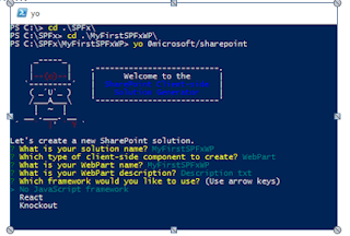
10. Creating an SPFx WebPart
Explanation:
Creating an SPFx WebPart involves several steps, from scaffolding the project to writing code and deploying it.
Steps:
- Install the SharePoint Framework Yeoman generator:
npm install -g @microsoft/generator-sharepoint - Scaffold a new project:
yo @microsoft/sharepoint - Develop the WebPart: Write your code in the generated project structure.
- Run it locally: Test your WebPart using
gulp serve.
Code Example:
typescript
export default class MyWebPart extends BaseClientSideWebPart<IMyWebPartProps> {
  public render(): void {
    this.domElement.innerHTML = `<div>Hello, World!</div>`;
  }
}
Explanation:
- Scaffolding: The Yeoman generator sets up a complete project structure, including WebPart templates and configuration files.
- Rendering: The
rendermethod is where you define what the WebPart displays on the page.
11. Steps to Deploy an SPFx Solution
Explanation:
Deploying an SPFx solution involves bundling and packaging your project, then uploading it to the SharePoint App Catalog for deployment.
Steps:
- Bundle the solution:
gulp bundle --ship - Package the solution:
gulp package-solution --ship - Upload the
.sppkgfile to the SharePoint App Catalog. - Deploy the solution from the App Catalog.
- Add the WebPart to a SharePoint page.
Explanation:
- Bundling and Packaging: The
--shipflag ensures that the solution is optimized for production. - App Catalog: The
.sppkgfile is the package that contains your solution and must be deployed to the App Catalog to be available across the SharePoint tenant.
12. Handling Authentication in SPFx
Explanation:
SPFx handles authentication through Azure Active Directory (AAD). When you make API calls, SPFx ensures that they are authenticated using AAD tokens.
Scenario:
When accessing the Microsoft Graph API or other secure resources, SPFx automatically handles OAuth authentication, making it seamless for developers to interact with protected resources.
Code Example:
typescript
import { MSGraphClient } from '@microsoft/sp-http';

this.context.msGraphClientFactory
  .getClient()
  .then((client: MSGraphClient) => {
    client
      .api('/me')
      .get((error, response: any, rawResponse?: any) => {
        console.log(response);
      });
  });
Explanation:
MSGraphClient: This client is provided by SPFx to interact with Microsoft Graph securely.- Token Management: SPFx manages AAD tokens, so developers don’t need to handle token refreshes or authentication challenges manually.
13. Purpose of the manifest.json File in SPFx
Explanation:
The manifest.json file in SPFx defines metadata about the WebPart, such as its title, description, icon, and entry point. SharePoint uses this file to understand how to render and manage the WebPart.
Key Properties:
id: Unique identifier for the WebPart.alias: A short, readable name for the WebPart.version: The version of the WebPart.entryPoint: The JavaScript file that should be loaded to run the WebPart.
Code Example:
json
{
  "id": "c4bf8447-1234-4c8d-9ec7-dcb112345678",
  "alias": "MyWebPart",
  "componentType": "WebPart",
  "version": "1.0.0",
  "manifestVersion": 2,
  "preconfiguredEntries": [{
    "title": { "default": "My WebPart" },
    "description": { "default": "This is my custom WebPart." },
    "officeFabricIconFontName": "Page",
    "properties": {}
  }]
}
Explanation:
- Metadata: This file provides the necessary metadata for SharePoint to properly load and display your WebPart.
- Customization: The
preconfiguredEntriesarray allows you to define multiple pre-configurations of your WebPart.
14. Versions of SharePoint
Explanation:
SharePoint has evolved over time with several versions, each offering different features and capabilities.
Key Versions:
- SharePoint 2010: On-premises, with basic collaboration features.
- SharePoint 2013: Introduced the App model and a more modern UI.
- SharePoint 2016: Hybrid capabilities, bridging on-premises and cloud.
- SharePoint 2019: Modern UI, similar to SharePoint Online.
- SharePoint Online: Cloud-based, part of Microsoft 365, with continuous updates.
Explanation:
- Evolution: Each version of SharePoint has introduced new features and improved user experiences, with SharePoint Online offering the most up-to-date capabilities.
15. SharePoint Content Types
Explanation:
SharePoint Content Types are reusable collections of metadata (columns), workflows, and behaviors that are applicable to items or documents within a SharePoint list or library.
Usage Scenario:
Content Types allow organizations to standardize metadata across multiple lists or libraries, ensuring consistency in how data is captured and used.
Code Example:
xml
<ContentType ID="0x0101009189AB5D3D2647B580F011DA2F356FB2"
             Name="Project Document"
             Group="Custom Content Types"
             Description="Document content type for project documents"
             Version="0">
  <FieldRefs>
    <FieldRef ID="{guid}" Name="ProjectName" />
    <FieldRef ID="{guid}" Name="ProjectManager" />
  </FieldRefs>
</ContentType>
Explanation:
- FieldRefs: Define the fields (columns) that are part of the content type.
- Inheritance: Content Types can inherit from parent content types, allowing for structured and organized data management.
16. PnP JS and REST API in SPFx
Explanation:
PnP JS and REST APIs are two ways to interact with SharePoint data in SPFx. PnP JS is a fluent JavaScript library that simplifies interactions with SharePoint, while REST API provides a more direct way to perform CRUD operations.
PnP JS Example:
import { sp } from "@pnp/sp/presets/all";

sp.web.lists.getByTitle("Documents").items.get().then(items => {
  console.log(items);
});
REST API Example:
fetch(`${this.context.pageContext.web.absoluteUrl}/_api/web/lists/getbytitle('Documents')/items`, {
  headers: {
    "Accept": "application/json;odata=nometadata",
    "odata-version": ""
  }
})
.then(response => response.json())
.then(data => console.log(data.value));
Explanation:
- PnP JS: Provides a higher-level abstraction for interacting with SharePoint, making code cleaner and easier to maintain.
- REST API: Offers more control and flexibility, but requires more boilerplate code.
Conclusion
React and SPFx are powerful tools for building modern web applications and SharePoint customizations. Understanding these technologies through interview questions, scenarios, and code examples is crucial for mastering the concepts and succeeding in technical interviews. Practice these examples and explore more complex scenarios to deepen your knowledge and build confidence.
Comments
Post a Comment